GearUp | Vehicle Maintenance & Repair App
1 | Overview
GearUp is a blend of Kelly Blue Book, YouTube tutorials, and expert mechanics to empower car novices. Where you can easily manage vehicle maintenance, save time, and cut costs.
My Roles:
User Researcher
Product Designer
Visual Designer
UX Designer
Usability Testing Administrator
My Responsibilities:
Interviewing users and stakeholders
Defining problem & establishing requirements
Creating new workflows
Creating sketches, wireframes, and prototypes, and various assets
Developing the design system
Interaction design
Troubleshooting technical issues
2 | Strategy
At the onset of every project, it's essential to establish the purpose by addressing the question, "why are we doing this?”. Once the overarching “why” is identified, I like to do some preliminary research based on my assumptions and see what the broad strokes are of the problem the product addresses.
In the case of GearUp, my assumption was that people don’t trust repair shops, but don’t know enough about cars to feel like they could repair their own. Research on this assumption revealed that, overall, my assumption is mostly true and it produced some surprising statistics that were great for aligning purpose throughout the process.
2 out of 3
U.S. drivers do not trust auto repair shops in general
73%
cited overcharging for services as the reason for their distrust
91.8%
of car owners admitted they’ve put off a car care task longer than they should
52%
said the reason for delaying repairs was because they couldn’t afford it
After my preliminary research I begin employing various methodologies such as Lean Canvas, Empathy Map, Feature Inspection, Heuristics Inspection, and crafting Personas, alongside analyzing Primary vs Extreme users. Through this comprehensive approach, I distill valuable data, identifying key pain points that GearUp aims to address with its services. These provide initial alignment of purpose for GearUp and aid in keeping development on course throughout the design process.
3 | Research
Now that I know what problem I’m solving and have some idea of the direction I need to go, I start to dig in to the user research to figure out the answer to “who exactly are we making this for?”. To do that, I use a few common research tools such as a Lean Canvas, Empathy Map, Cluster Board, Personas, and analysis of Primary vs Extreme users.
Filling out the Lean Canvas gives me an idea of the main problems I want to solve with GearUp as well as where I can really make my app shine. It also gives me a quick look at channels I want to use to reach customers as well as possible revenue streams.
The empathy map really helps me get in touch with my potential users. It lets me put myself in their shoes to understand the problem I’m trying to solve and the roadblocks that they might face.
Once I’ve done the empathy map, using a cluster board to organize my points into themes helps me narrow down the overarching problems facing my primary users. It provides me a way to think about what my information architecture might be as well as my main features in the app.
Personas
To get a better idea of the types of users we are targeting and those that might benefit most from the product, I create four primary user personas. Three of them are women as the statistics, my assumptions, and the user research already done weigh heavily towards women being the primary demographic of GearUp.
Competitive Analysis
I join the stakeholders in conducting research to gain insights into the features and solutions of our competitors. I identify five of our main competitors, then create a comparison matrix based on the features I plan to implement into GearUp. The results of this matrix allows me to see how to position GearUp to cover gaps in the matrix.
Gaps In Offerings
Competitors lack easily navigable databases of extensive knowledge
Opportunity for growth and innovation in offering a diagram of a user's vehicle
Integration with On Board Diagnostic devices
How The Design Changed
I focus my efforts on breaking up information into sections and providing quick links to those sections instead of just supplying an extensive, searchable knowledge base
I decide to lean more heavily on AR (Augmented Reality) technologies to give the user a comprehensive and intuitive experience when navigating their engine and plan for AI (Artificial Intelligence) technology support the AR instead of being a main feature
Heuristics Evaluation
I continue through my process and do a more detailed heuristics inspection on the frontrunner of our competitors - CYTK.io. In order to do this, I choose to evaluate the first time user flow for the competitor’s experience.
Primary Users vs Extreme Users
Though I knew our primary users would be those that fit the persona types I created, a better understanding of the users at opposite ends of the spectrum is needed. To this end, I went through a simple exercise to anticipate the needs and use cases for our extreme users.
Key Findings
The information I collected from these methods supports the concerns shown in the initial statistics. The research shows that users need the following out of a vehicle maintenance app:
Easily Navigable Resources - comprehensive knowledge/tutorials that are easy to find based on their issue.
Leveraging A.I./A.R. - instant recommendations and/or resources based on user input and real-time navigation for their vehicles.
Multiple Avenues - different ways to find the information they need depending on how they want to interact with the app.
Vehicle Records - easily record and reference maintenance on their vehicles.
4 | Design
GearUp's purpose is to process a large amount of data, filter it for the user's knowledge level and needs, and present it in an easy to navigate, easy to follow, format. Keeping this in mind, I wanted the workflow to be as simple as possible and not overwhelming the user as they set out on their journey to accomplish a task.
Epics & User Stories
I wanted to ensure a user-centric approach by breaking down features into smaller, actionable tasks. These epics help to break GearUp's offerings into functional groups and the user stories help to meet user needs throughout the development cycle. Below are a few of the epics with an accompanying user story.
EPIC: Troubleshoot mechanical issues on a vehicle
“I need to be able to find out what issues my vehicles may have.”
EPIC: Perform regular maintenance on a vehicle
“I need to be able to do regular maintenance on my car on my own or at least know what issues I have.”
EPIC: Keep track of vehicle maintenance in one place
“I need to be to know what maintenance I have done on my vehicle in one spot so it's easy for me to access.”
EPIC: Augmented Reality overlay to navigate my vehicle engine
“I want to use an AR overlay to easily navigate through my vehicle's unique engine layout.”
Functional Groups
I use the epics to help me create the functional groups for GearUp’s workflows and the user stories to lay the groundwork for the stepped out process within the workflow. These functional groups play an important part by forming the scaffolding for the workflows.
Workflows
I use the functional groups to craft a user flow illustrating three experience flows within the GearUp app. As I work through the flows, I decide that there is potential for monetization and revenue in creating a premium tier to GearUp’s features. The stakeholders also request a rewards module to be worked in to the flows to boost engagement with the app. With this in mind, I create flows for a first time user, repeat user, and premium user. I iterate on these workflows until I have a flow I am okay to move forward with, knowing that it will likely go through more iterations in the future.
Sketches
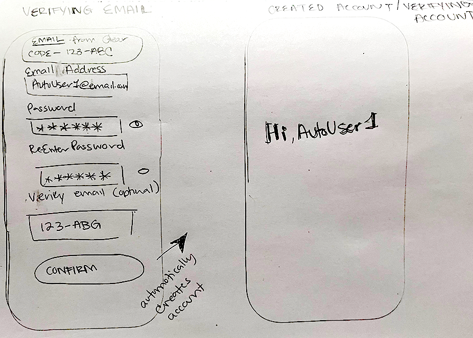
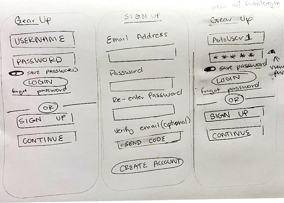
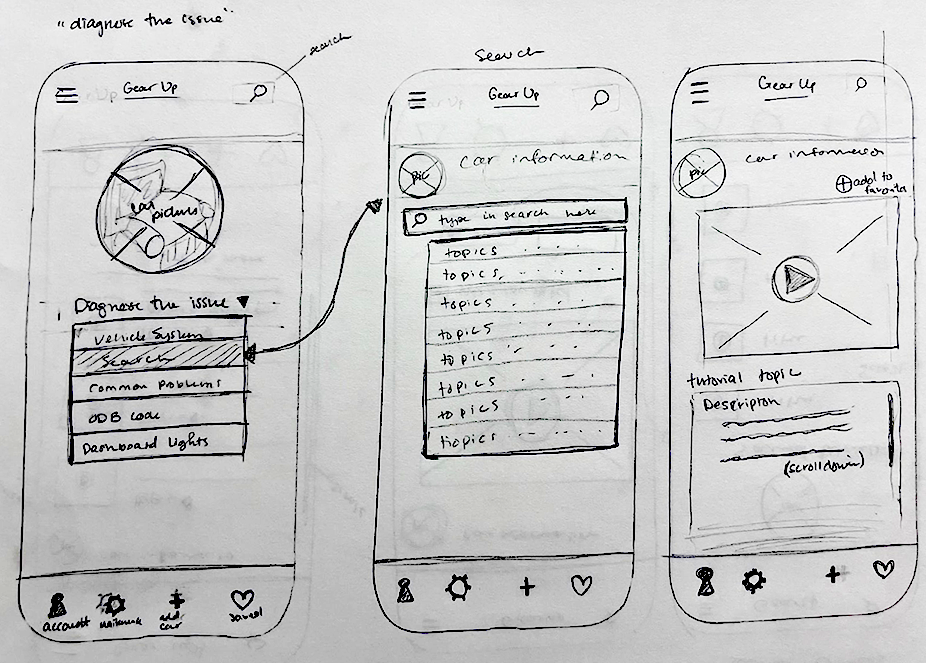
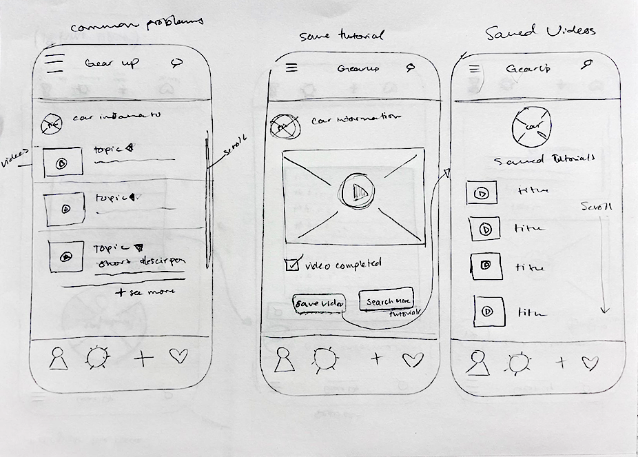
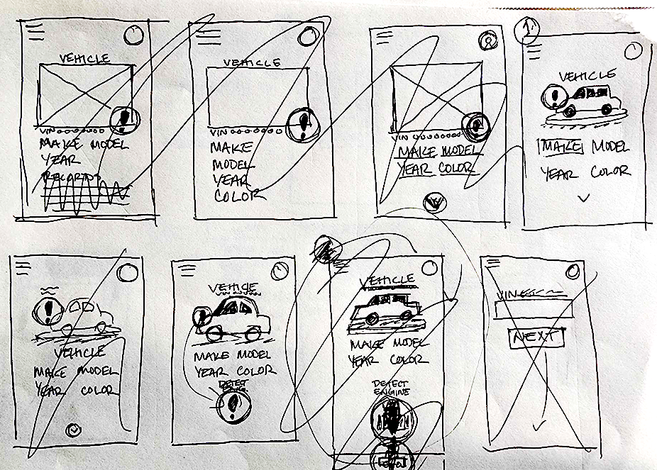
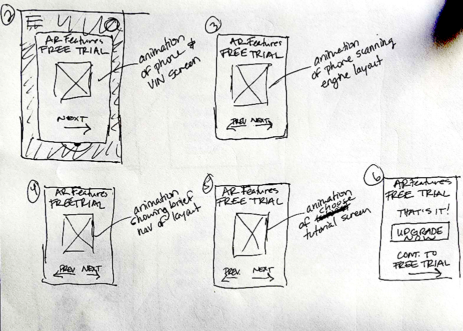
After creating the initial user workflows, I transition to the visual design phase, where I sketch some of the screens for the GearUp experience. These sketches help me conceptualize how users might navigate through the app visually and efficiently. Since these are quick, rough sketches, they allow rapid ideation and give visual weight to the user flows and individual interactions without investing too much time in designs that are not the best user experience.



Low Fidelity Wireframes
After ideating on some initial sketches and finding some successful options for interactions, I progress to creating wireframes. Initially, I work in grayscale to ensure optimal contrast and accessibility as well as to evaluate sizing and flow within the design. Due to time constraints on the project, I start usability testing with the low fidelity wireframes. The usability testing runs in tandem with creating the high fidelity wireframes.
High Fidelity Wireframes
I meet with stakeholders for feedback and then iterate further on the low fidelity wireframes. I refine the layout, navigation, and interactions based on feedback and usability considerations. Since usability testing is being performed concurrently, I work to incorporate as much user feedback as possible in each iteration so that I can address any identified issues or concerns within the time constraints.
Style Guide
While iterating on the wireframes and setting up for usability testing, I create a quick style guide to aid in quickly laying in colors and fonts. This speeds up the process of refining the prototype later on in the process.
5 | Usability
During usability testing, I focus on evaluating the app's key features—the diagnose module and the augmented reality map. I collect feedback on how users feel about these functionalities, as well as their experience managing multiple vehicle profiles and interacting with the GearPoints system.
Low Fidelity Prototype
I create a prototype from the low fidelity wireframes so that usability testing can begin. I administer testing and gather feedback in tandem with creating the high fidelity wireframes and establishing a fleshed out design.
Usability Feedback | Diagnose Module
The user feedback on the Diagnose module focuses around a lack of guidance to begin searching for the their issue. Some examples of this being the visibility of the search bar, stronger visibility of the Common Problems category, and having links on the tutorial page to help users source parts they would need to complete their task.
Would like a quick description of the icons
Some search options were too advanced
Users overlooked or struggled to find the search bar
Not intuitive or insightful
Would love to see a link in the tutorial screen that takes you to a place you can buy the parts you need
Had a delighted reaction when they clicked “Mark Complete”
“Common Problems” should stand out more
Usability Feedback | Augmented Reality Map
The user feedback on the Augmented Reality Map mostly touched on confusion around terminology, where to locate the vehicle identification number, and visual complications of navigating the overlay.
Confused about what “AR” is
Didn’t know where the VIN is located on their vehicle
Needs to be more “beginner friendly”
AR Map should be one of the first things suggested when the app is opened
AR Map icon isn’t understandable
Had difficulty exiting the AR Map
White boxes covered parts of the engine
Positive Results
Though identifying pain points is crucial for continual product improvement, receiving positive feedback is always appreciated. The positive feedback helps me identify where the app is excelling and confirms alignment with our key demographic audience.
“The app's depth is impressive without being overwhelming.”
“The search function let me go as shallow and as deep as I want.”
“ Great for families because you can put multiple cars”
“[The AR Map] is dummy proof.”
“Something like [GearUp] could have saved me $3200 on repairs to my current vehicle.”
Future Goals
As you can see, there are several features and pain points for future development. However, where I am now is a great place to be because I have a simple base platform with two powerhouse features. Where I have been has informed me on the gaps that our app is poised to fill. And where I am going is to break down the barriers that separate those with knowledge and those without.
Patrice Banks at The Washington Post said, “When a woman can negotiate, it’s empowering.”
With GearUp, all users can feel empowered.


